 Denis Serden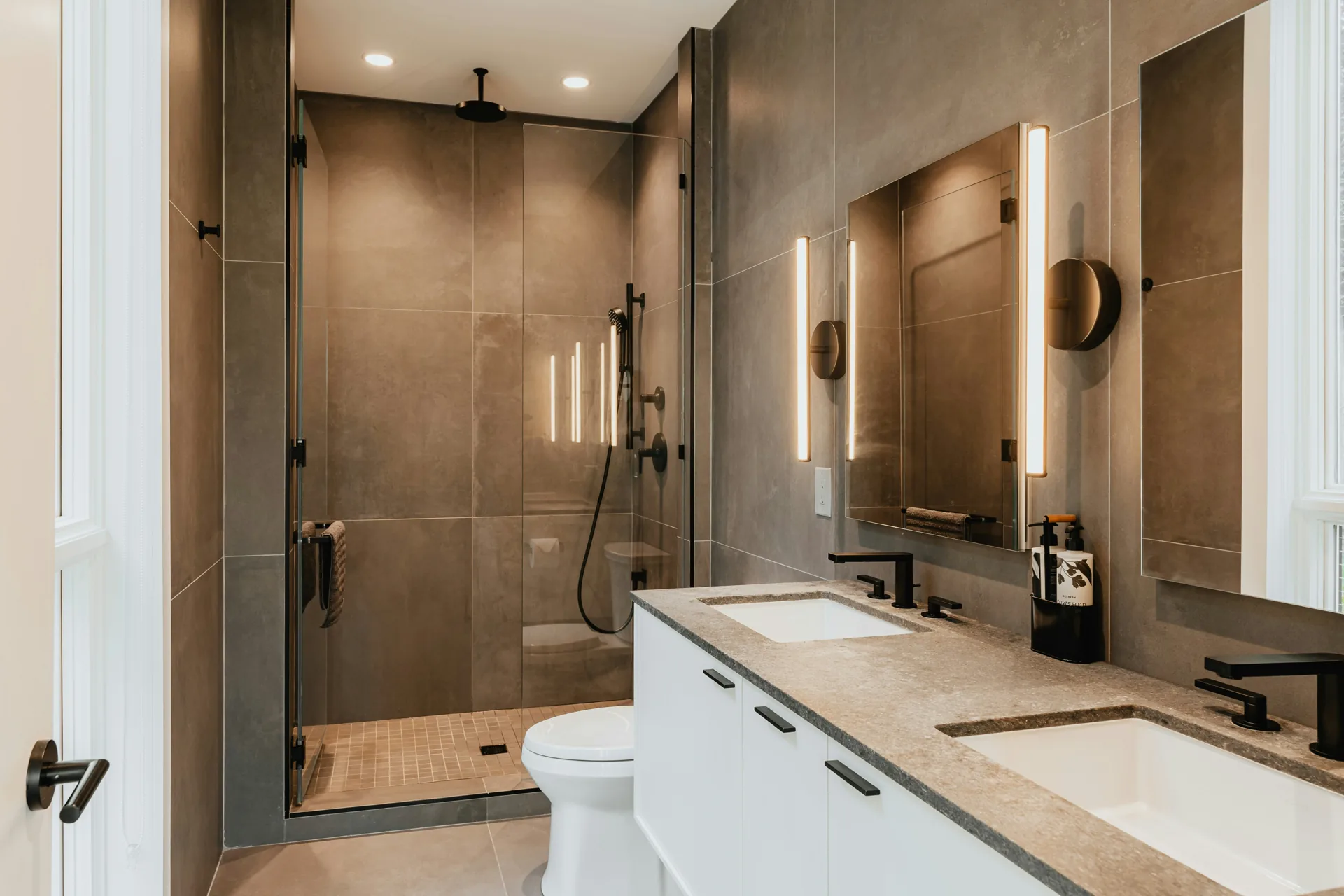
Bathroom colors in 2026 are moving warmer, softer, and more natural. The strongest bathroom paint colors this year include warm neutrals, earthy greens, soft blues, creamy whites, moody charcoals, and muted terracotta accents that add depth without making the space feel dated.
Why bathroom colors in 2026 are shifting warmer
Bathroom colors are trending warmer in 2026 because homeowners want spaces that feel calmer, cleaner, and less stark. The cool gray wave that dominated many remodels over the last decade has lost ground to color palettes that feel more lived-in and easier to pair with wood tones, stone, and brushed metal finishes.
You can see this shift across paint brands and design showrooms. White is still popular, but the bright blue-white shades are giving way to creamy whites and soft off-whites. Gray still has a place, though it now leans taupe, mushroom, or charcoal instead of icy silver. Even color-forward bathrooms are using toned-down versions of green, blue, and terracotta rather than saturated statement walls.
That matters if you're remodeling for both personal style and long-term value. Warm-leaning bathroom paint colors usually age better because they work with more finish combinations. They also soften hard surfaces like porcelain tile, quartz counters, frameless glass, and painted cabinetry.
The top trending bathroom colors for 2026
The strongest bathroom colors in 2026 balance comfort with restraint. Most successful remodels use one dominant wall color, then layer texture and contrast through tile, wood, stone, and metal.
Warm neutrals
Warm neutrals are leading the market because they solve several design problems at once. They make a bathroom feel inviting, they flatter skin tones in the mirror, and they pair well with white fixtures that can otherwise feel too sharp.
Popular warm neutrals include:
- Greige with beige undertones
- Mushroom and putty tones
- Soft taupe
- Sand and oat shades
- Pale clay-inspired beige
These neutral bathroom paint colors work especially well in primary bathrooms and resale-focused remodels. If you want a safe choice that still feels current in 2026, start here.
Earthy greens
Muted green is one of the clearest trending bathroom colors for 2026. Homeowners are choosing sage, olive-gray, eucalyptus, and dusty moss because those shades add color without overpowering a small room.
Earthy greens pair especially well with:
- White oak vanities
- Warm brass hardware
- Cream subway tile
- Honed marble-look quartz
- Matte black accents for contrast
In practice, sage is the most flexible pick. Darker olive works best in powder rooms or larger bathrooms with strong lighting.
Soft blues
Soft blue remains a reliable bathroom color because it reads clean and relaxed. In 2026, the better choices are gray-blue, mist blue, and muted coastal blue rather than bright aqua or highly saturated navy across every wall.
Blue works best when you keep the undertones consistent. A cool blue wall next to a creamy yellow-white tile often looks off. A soft gray-blue next to marble-look porcelain or crisp white trim usually looks intentional.
Moody charcoals
Charcoal is the darkest shade still showing up heavily in premium bathroom remodels. It gives a room depth and contrast, especially when paired with floating vanities, wall sconces, and large-format tile.
Use moody charcoals carefully. They work best in larger bathrooms, powder rooms, or spaces with layered lighting. In a small bath with one ceiling light and no window, dark charcoal can flatten the room fast.
Creamy whites
Creamy white is replacing sterile white in many remodeled bathrooms. The reason is simple: it feels softer, and it handles shadows better. Pure white can turn harsh under LED lighting, especially if the bulbs run cool.
Look for whites with slight beige, ivory, or linen undertones. Those shades stay bright without feeling clinical. They also work well with the warmer cabinet stains and brass finishes that continue to trend in 2026.
Muted terracotta accents
Muted terracotta is showing up more as an accent than a full-room color. It adds warmth and personality, but too much can make a bathroom feel heavy.
Most homeowners use terracotta through:
- A vanity color
- Niche tile
- Handcrafted-look backsplash tile
- Decorative accessories
- Wallpaper in a powder room
If you want color without a big commitment, this is a smart way to get it.
How bathroom colors affect room size, light, and resale
Color changes how large a bathroom feels, how well it reflects light, and how broad its resale appeal will be. Those effects are practical, not theoretical.
Lighter bathroom colors reflect more visible light, so walls appear to recede. That makes small bathrooms feel larger. Darker colors absorb more light, which can make walls feel closer and the room feel more enclosed. In a spacious primary bath, that can feel rich and grounded. In a tight hall bath, it can feel cramped.
Undertone matters just as much as value. A pale paint color with a green undertone can look muddy next to pink-beige tile. A warm neutral next to a cool gray floor can make one finish look dirty even when both were attractive on their own.
For resale, neutral bathroom paint colors still win most often. They appeal to more buyers, photograph better in listing photos, and give the next owner room to add personality through towels, mirrors, and hardware. That doesn't mean every bathroom should be beige. It means the most expensive surfaces — tile, counters, and cabinetry — should stay versatile if resale matters to you. If you're weighing where the budget goes on those surfaces, our guide to bathroom remodel costs in Vancouver, WA breaks it down by scope and material tier.
Here is a quick planning guide:
| Goal | Best Color Direction | Why It Works |
|---|---|---|
| Make a small bathroom feel bigger | Creamy white, soft greige, pale blue | Reflects light and pushes walls outward visually |
| Warm up a cold bathroom | Taupe, sand, soft clay, muted green | Offsets cool tile and harsh lighting |
| Improve resale appeal | Warm neutral, soft white, muted blue | Broad buyer appeal and easy styling |
| Add drama in a larger bath | Charcoal, deep olive, dark blue-gray | Creates contrast and visual depth |
| Brighten a low-light room | Light warm white, pale greige, soft beige | Prevents gray, shadowy corners |
Best bathroom colors for small bathrooms
Small bathrooms usually look best in lighter mid-tone colors, not necessarily pure white. That surprises a lot of homeowners. Bright white can work, but if the room has average lighting and standard builder finishes, a softer color often looks more polished.
Best color choices for compact bathrooms
The best bathroom colors for small bathrooms include:
- Creamy white
- Warm off-white
- Pale greige
- Light taupe
- Soft sage
- Misty blue-gray
These shades keep the room open while adding enough depth to avoid a flat, builder-grade look.
What to avoid in a small bathroom
Dark paint is not always wrong in a small bathroom, but it needs support. Without good lighting, taller ceilings, or strong contrast from tile and trim, it can make the room feel boxed in.
You should also be careful with yellow-heavy beige, bright pastel blue, and trendy colors that fight with fixed finishes. Small bathrooms don't have much visual space, so one mismatch stands out faster.
One design move that helps more than paint alone
Use the same wall color and trim color in slightly different sheens. That reduces contrast lines and helps the room read as larger. In many remodels, this has a stronger visual effect than changing the paint color by itself.
Best bathroom paint colors for low natural light
Bathrooms with low natural light need colors that stay warm in shadow. North-facing rooms, interior bathrooms, and spaces with only a small window often turn cool paint gray and lifeless.
The best bathroom paint colors for low natural light are:
- Soft ivory
- Warm white
- Linen
- Pale mushroom
- Light greige
- Dusty sage with warm undertones
Skip stark white in most dim bathrooms. Under standard 3000K LED vanity lights, stark white can look blue. Skip muddy gray too. It often picks up the shadows and makes the room feel dingy.
Serden Group tip: Lighting temperature matters here. If you're remodeling the room, choose paint after your lighting plan, not before. A color that looks balanced under showroom lights can shift once it's under your sconces, can lights, and mirror lighting at home. See how selections fit into the build in our week-by-week bathroom remodel timeline.
How to pair wall colors with tile, vanities, counters, and hardware
Most bathroom color problems come from bad pairings, not bad paint colors. A wall color can look perfect on a swatch and still fail once it sits beside tile, cabinetry, and countertop material. It's one reason we handle color, tile, and finishes together on every bathroom remodeling project.
Pairing paint with tile
Start with the tile because it is the harder surface to change later. Pull the undertone from the tile, then choose paint that supports it.
- Warm tile works best with creamy white, taupe, sand, and muted green
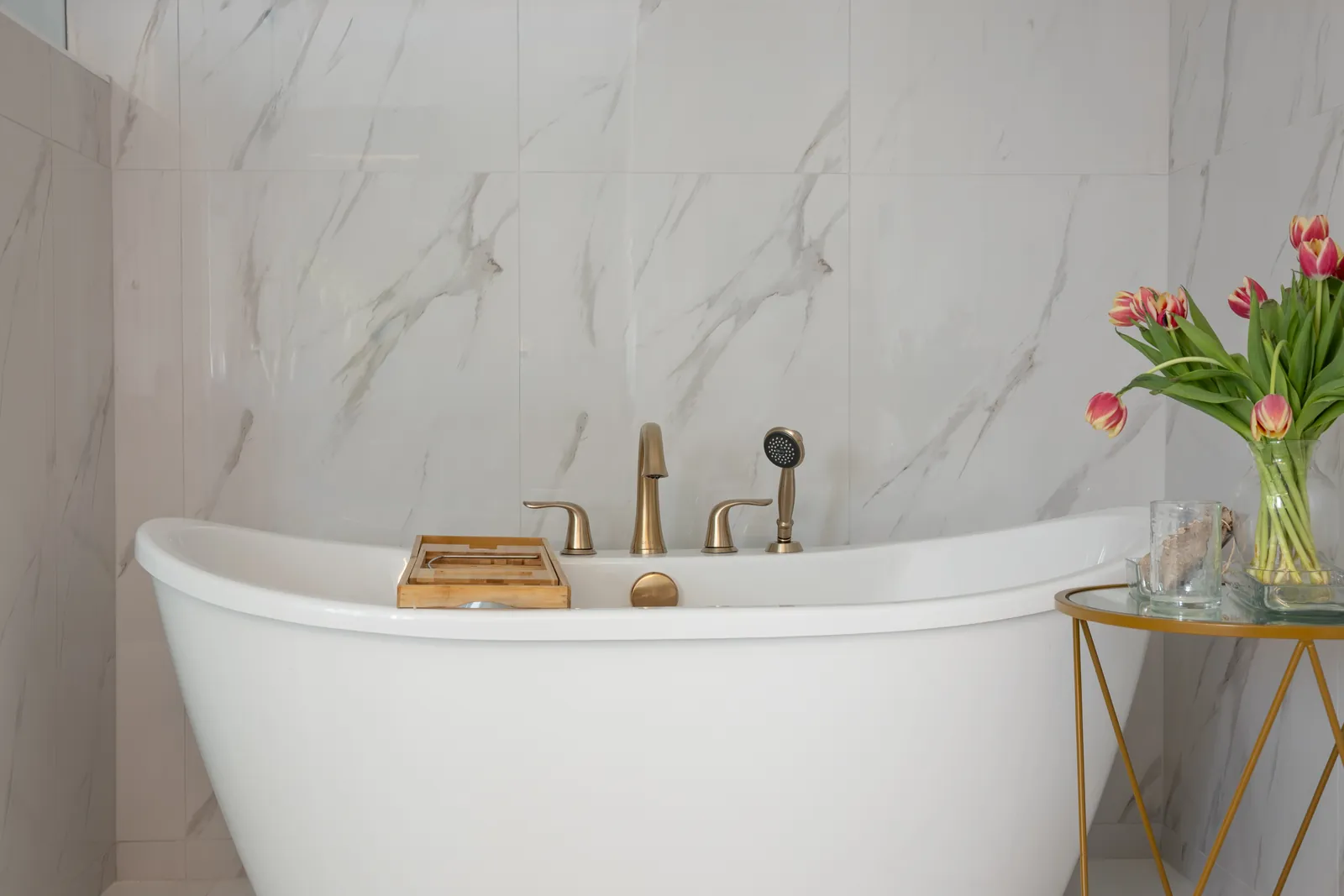
- Cool gray or marble-look tile works best with soft white, blue-gray, or restrained greige
- Terracotta or handmade-look tile works best with warm white, clay beige, or earthy green
If your tile has strong pattern movement, keep wall color quieter. If the tile is simple, the wall color can do more work.
Pairing paint with vanity finishes
Vanity color and wood tone change how wall paint reads. White oak, walnut, painted navy, painted green, and warm white vanities are all common in current remodels.
Here are reliable combinations:
- White oak vanity + sage walls + brushed brass hardware
- Warm white vanity + creamy white walls + polished nickel
- Walnut vanity + soft greige walls + matte black hardware
- Charcoal vanity + pale taupe walls + brass accents
- Blue-gray vanity + soft white walls + chrome or nickel
Pairing paint with countertops
Quartz and stone should temper the room, not compete with it. If the countertop has bold veining, keep the wall color restrained. If the counter is solid and quiet, you have more freedom on the walls.
Warm white quartz with subtle beige veining works with nearly every neutral bathroom paint color on this list. Bright white quartz with cool gray veining needs more care. Pair it with cool whites, restrained grays, or muted blue-greens unless you're intentionally mixing warm and cool tones with a designer's eye.
Pairing paint with hardware and mirrors
Hardware acts like the jewelry of the room. It can sharpen the palette or soften it.
- Brushed brass warms up greens, taupes, terracotta, and creamy whites
- Matte black adds contrast to pale walls and wood vanities
- Polished nickel suits soft whites, blues, and classic transitional bathrooms
- Chrome works best in cleaner, cooler palettes
If you mix metals, repeat each finish at least twice so it looks planned.
Common bathroom color mistakes to avoid
The most common mistake is choosing paint first. In a remodel, paint should usually come after tile, vanity finish, countertop, and lighting are selected.
Another mistake is testing too small. A two-inch paint chip tells you almost nothing in a bathroom with steam, mirror reflections, and mixed lighting. Use large sample boards and check them morning, afternoon, and night.
Many homeowners also pick colors that look trendy on social media but ignore the home's overall style. A moody charcoal bathroom can look excellent in a modern home. It can feel out of place in a traditional house with warm wood flooring and creamy trim throughout.
One more issue shows up all the time in the Portland and Vancouver area: gray daylight. Our regional light can mute already-cool colors, especially in winter. If you live in Vancouver, WA or the greater Portland metro, warmer paint often reads more balanced year-round.
Why homeowners in Vancouver WA and Portland work with Serden Group LLC
Color selection goes better when the remodel team understands the full room, not just the paint deck. That is where Serden Group LLC stands out.
Serden is a family-owned bathroom remodeling contractor serving Vancouver, WA and the Portland metro. The company has more than 20 years in business, 1,500+ completed projects, 290+ reviews across Google and Angi, a 5.0 Google rating, and 100% warranty coverage. That track record matters because bathroom color decisions affect tile, cabinetry, lighting, mirrors, trim, and installation details across the whole build.
If you're planning a bathroom remodel, Serden can help you make color choices that fit your home, your light conditions, and your finish selections. You get custom design guidance, clear communication, and design-build execution from one team instead of trying to coordinate paint, tile, and construction decisions in separate silos.
For homeowners in Vancouver, WA, Portland, and nearby communities, the easiest next step is to talk through your goals with a remodeling team that does this every day. Call (360) 836-7775 to start planning your bathroom remodel.
Frequently Asked Questions
What are the most popular bathroom colors in 2026?
The most popular bathroom colors 2026 homeowners are choosing are warm neutrals, creamy whites, earthy greens, soft blues, and charcoals. Muted terracotta is also trending, usually as an accent rather than the main wall color.
What color makes a small bathroom look bigger?
Light-reflective colors usually make a small bathroom look bigger. Creamy white, pale greige, soft taupe, and light blue-gray tend to open the room visually better than dark paint.
Are neutral bathroom paint colors still good for resale?
Yes, neutral bathroom paint colors still offer the safest resale appeal. Warm whites, soft greiges, and light taupes appeal to more buyers and work with a wider range of tile and vanity styles.
What bathroom colors work best with low natural light?
Bathrooms with low natural light usually look best in warm white, ivory, pale mushroom, or light greige. Those colors hold up better in shadow and avoid the cold cast that stark white or cool gray can create.
Should I choose paint before tile and vanity finishes?
No. In most remodels, you should choose paint after the fixed finishes. Tile, vanity color, countertop material, and lighting all affect how bathroom paint colors read once they are on the wall.
Ready to choose the right palette for your bathroom remodel in Vancouver, WA or Portland? Request your free on-site estimate from Serden Group. We serve Vancouver, Camas, Washougal, Battle Ground, Ridgefield, Portland, and surrounding communities.